
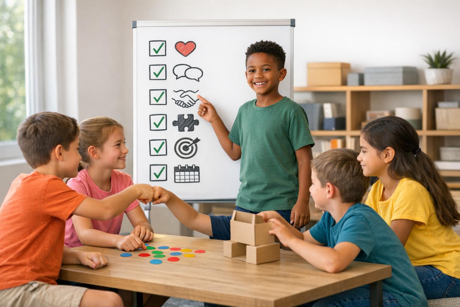
Designing mobile websites for kids requires a unique approach. Unlike adults, children interact with devices differently, relying on gestures like swiping and tapping. Their needs vary based on age, motor skills, and cognitive abilities. Parents, on the other hand, prioritize safety, fast load times, and clear navigation.
To create a kid-friendly mobile experience:
- Prioritize mobile-first design: Start with smartphones to ensure simplicity and functionality.
- Focus on usability for kids: Use large buttons (at least 75×75 pixels), bold visuals, and clear icons.
- Cater to parents’ concerns: Include privacy policies, parental controls, and safe browsing features.
- Speed matters: Pages must load in under 3 seconds to keep young users engaged.
- Test with real users: Involve kids and parents during testing to refine the experience.
This guide dives into strategies for designing websites that are engaging for kids while meeting parents’ expectations for safety and usability.
UI/UX Design Principles for Kids Apps | Ashley Samay
sbb-itb-a46f019
Why Mobile Design Matters for Kid Websites
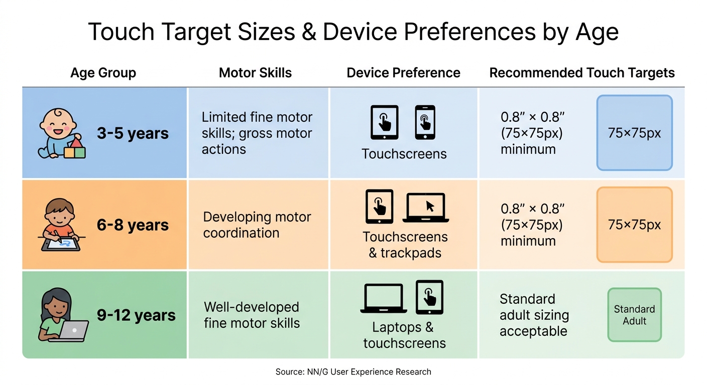
Touch Target Sizes and Device Preferences by Age Group for Kids
Growing Mobile Usage Among Parents and Kids
Mobile devices have become the go-to tool for families accessing the internet. By 2026, mobile devices will account for 72% of global web traffic, and kids under 13 will make up nearly a third of all tablet users. This trend reflects how children are getting introduced to the digital world earlier than ever - by age 3, many are already mastering swipes and taps. Over the past decade, screen time for kids has doubled. At the same time, parents rely heavily on their smartphones to manage their children's digital lives, from setting up parental controls to researching safe websites on the fly.
Google's mobile-first indexing means your website’s mobile version directly impacts its search ranking. Mobile-friendly designs also perform better, with 67% lower bounce rates and 23% higher conversion rates compared to desktop-only sites. And here’s the kicker: 57% of users say they won’t recommend a business with a poorly designed mobile site.
"Mobile will ultimately be the way you provision most of your services… the answer should always be mobile-first."
– Eric Schmidt, CEO of Google
These statistics make it clear: designing mobile-friendly websites is non-negotiable, especially for kid-focused platforms.
What Makes Kid-Focused Mobile Websites Different
Designing mobile websites for kids comes with unique challenges due to their physical and cognitive development. Younger children, especially those aged 3–5, lack refined fine motor skills, making precise clicks or drags difficult. They rely on broad, sweeping gestures, which makes touchscreens the most intuitive option for this age group. To accommodate them, touch targets should be at least 0.8 inches × 0.8 inches (around 75×75 pixels) - four times larger than the 0.4-inch standard for adults. Buttons placed too close together can lead to accidental clicks, causing frustration for young users.
Kids also expect instant feedback - whether visual or auditory - for every interaction. A well-designed kid-friendly interface needs to be simple, colorful, and responsive to keep them engaged. At the same time, parents - often referred to as “the most demanding users” - prioritize safety. They look for features like clear privacy policies, robust parental controls, and certifications from trusted sources like educators or doctors. Tools that allow parents to set time limits or permissions are also essential.
Here’s a quick breakdown of recommended touch target sizes and device preferences by age group:
| Age Group | Motor Skills | Device Preference | Recommended Touch Targets |
|---|---|---|---|
| 3–5 years | Limited fine motor skills; gross motor actions | Touchscreens | 0.8" × 0.8" (75×75px) minimum |
| 6–8 years | Developing motor coordination | Touchscreens & trackpads | 0.8" × 0.8" (75×75px) minimum |
| 9–12 years | Well-developed fine motor skills | Laptops & touchscreens | Standard adult sizing acceptable |
Children under 12 often struggle with abstract thinking, which means they may not fully grasp the consequences of actions like clicking on ads or sharing personal information. Features like parental gates - simple challenges such as math problems or reading tasks - can help block external links or unauthorized purchases. Additionally, since over 30% of kids use mobile devices in social settings, designs should support multi-touch functionality to prevent the interface from freezing when multiple fingers touch the screen.
Designing mobile experiences for kids isn’t about shrinking content - it’s about creating interfaces that reflect how young users naturally interact with technology.
Core Principles of Kid-Friendly Mobile Design
Responsive and Adaptive Design Basics
Responsive design is the backbone of any kid-friendly mobile experience. With 72% of global web traffic coming from mobile devices and kids primarily using tablets and smartphones, your site must work seamlessly on small screens. A mobile-first approach is key - start with the smallest screens (like phones) and scale up. This forces you to focus on what matters most: simplifying navigation, removing clutter, and ensuring primary actions are easily accessible.
Positioning interactive elements within the thumb zone (the bottom 40% of the screen) is crucial, as 75% of mobile interactions occur here. This placement makes it easier for kids to interact without stretching or needing two hands. For younger users, adaptive design goes a step further by tailoring experiences to their developmental stage. A 4-year-old's fine motor skills and cognitive abilities differ greatly from a 10-year-old's, so tap targets and spacing need to accommodate these differences.
"Mobile-first design is a design philosophy that starts with the most constrained environment (a phone) and progressively enhances for larger screens."
– John V. Akgul, AI Implementation Strategist, PxlPeak
Use modern tools like container queries and dynamic viewport units (dvh and dvw) to ensure content isn’t hidden behind address bars. Fluid typography with CSS clamp() ensures font sizes adjust smoothly across screen sizes. Speed is just as important - 53% of mobile users will abandon a page if it takes longer than 3 seconds to load. To keep your site fast, aim for a 150KB critical path budget, even on slower connections. These strategies create a smooth, kid-friendly experience while reassuring parents about reliability and safety.
Next, let’s look at how visuals and color can make your design more engaging for kids.
Simple Visuals and Bold, Kid-Friendly Colors
For young children, visuals speak louder than words. Kids aged 3–7 rely heavily on icons and images to navigate, while older kids (8–10) benefit from features like visual search and auto-complete since they read faster than they spell. High-contrast colors and bold icons are essential for grabbing attention and conveying meaning at a glance. Apps like YouTube and mobile games have set the standard, with their bright visuals and minimal text creating an intuitive experience for kids.
Flat navigation works best - keep everything important visible on the main screen. Hidden menus, like hamburger icons, can confuse kids and reduce discoverability by up to 50%. Typography also plays a role: stick to large font sizes (18–20 pixels) and use typefaces that mimic how kids learn to write in school. Avoid relying on gestures like pinching or swiping for navigation, as kids often don’t discover these on their own.
"It has to be bright, engaging and easy to use. You have to think even more intuitively when designing for kids."
– Drew Elrick, Web and Graphic Designer
Feedback is another must-have. Kids expect an immediate response - whether it’s visual, auditory, or haptic - for every action they take. Without it, they’ll assume the site is broken and leave. Use animations, sounds, or vibrations to confirm interactions and keep them engaged.
But beyond fun visuals and interactivity, safety and privacy are non-negotiable.
Building Safety and Privacy Into Your Design
Parents are the gatekeepers, and earning their trust is essential. To do this, your design must prioritize safety. This means limiting data collection, avoiding intrusive ads, and incorporating robust parental controls.
Kids under 12 often struggle to tell the difference between ads and actual content, so transparency is critical. Avoid external links that could lead kids into unmonitored spaces - this is a major concern for parents. If external links are necessary, include parental gates (like simple math problems or reading tasks) to block unauthorized access.
Parental tools like time limits, activity reviews, and permission controls are essential for building trust. Parents also look for clear privacy policies and certifications from trusted sources, such as educators or medical professionals. Your design must cater to both audiences: kids who want to explore and play, and parents who need peace of mind.
"The best children's apps don't just entertain or educate - they create a space where kids can explore, learn, and play without parents having to worry about what's lurking around the next corner."
– Simon Lee, Experience Designer
Safety isn’t an afterthought - it’s a core part of the design. By building safety and privacy into every aspect, you’ll win the confidence of both kids and their parents.
Designing for Small Hands and Young Minds
Touch-Friendly Buttons and Tap Targets
Children’s developing fine motor skills mean they need larger touch targets to interact comfortably with apps and devices. While adults can handle buttons as small as 1 cm x 1 cm, children require targets at least 2 cm x 2 cm (approximately 75 pixels or 0.8 inches).
Spacing matters too. Leaving a gap of 8 to 12 pixels between buttons reduces accidental taps. Since younger kids rely more on gross motor skills than precise finger movements, simple gestures like tapping and swiping are the easiest for them to manage. Dragging, however, can be tricky for kids under 9, so offering alternatives - like tapping a destination instead of dragging an object - can make interactions smoother.
"Touch gestures such as swiping and tapping big targets are easy for all children, but fine mouse or trackpad gestures such as dragging are hard for young kids."
– Feifei Liu, User Experience Specialist, NN/G
Another key consideration is button placement. Avoid putting critical buttons at the very bottom of the screen, as kids often grip devices in ways that might accidentally trigger them. Instead, place essential actions within the thumb zone for easier access. Use bright, colorful buttons with clear icons rather than text links, as children tend to rely on visual cues rather than reading.
These design principles not only make navigation easier but also set the stage for interactive elements that invite kids to explore.
Interactive Elements That Encourage Exploration
Exploration is how kids learn, so interactive design should focus on encouraging curiosity and providing immediate feedback. Whether it’s a sound, animation, or visual cue, kids need to see their actions acknowledged instantly.
Building on touch-friendly designs, interactive elements should also be forgiving. For instance, if a child drags an object slightly outside the target area, allow the action to complete instead of forcing them to start over. Providing multiple ways to accomplish a task - like offering both drag-and-drop and tap-to-place options - can accommodate a range of skill levels.
"UIs that exceed the kids' motor ability will discourage them and even make them lose confidence in the device."
– Feifei Liu, User Experience Specialist, NN/G
For younger kids (ages 6–8) who are still mastering reading, audio instructions or voiceovers can offer helpful guidance. To further simplify interactions, reduce the need for text-based input by incorporating features like auto-complete or visual search. Since abstract thinking is often challenging for children under 12, using literal icons with clear, real-world meanings - like a house icon for "Home" - can make navigation more intuitive.
Performance Optimization for Kid Websites on Mobile
Reducing Load Times with Optimized Media
When it comes to kids, speed is everything. If a page takes too long to load, they’ll lose interest almost instantly. In fact, more than half of users will abandon a site if it takes over three seconds to load. As Vitaly Friedman from Smashing Magazine puts it:
"Children tend to lose focus and motivation. They quit when they get bored, and they move on if they can't get anywhere quickly enough".
Images are often the biggest culprits behind slow load times, so optimizing media is a must. Start by using modern file formats like AVIF, which are up to 50% smaller than JPEGs and supported by 93% of browsers. For a fallback, WebP is another great option, offering 39% smaller file sizes compared to older formats. To further speed things up, apply the loading="lazy" attribute to images below the fold, ensuring critical content loads first.
Keep your critical path (HTML, essential CSS, and above-the-fold images) under 150KB. Also, define image width and height attributes to prevent layout shifts, which can disrupt the user experience. Skeleton screens - those lightweight placeholders that load first - can cut perceived wait times by 15–20%.
For users on slower networks like 2G or 3G, the Network Information API can detect connection quality and serve lower-resolution images. This is crucial because every extra second of load time can reduce conversions by 7%.
By fine-tuning media, you not only speed up your site but also pave the way for smoother, kid-friendly navigation.
Creating Clear and Simple Navigation
A fast site is just the beginning - navigation needs to be equally straightforward, especially for kids who have little patience for confusing layouts. For starters, make sure tap targets are large enough - at least 75 × 75 pixels - to accommodate their developing motor skills. Place key navigation elements in the bottom-center arc of the screen, where thumbs naturally rest, as about 75% of mobile interactions are thumb-driven.
For younger users, icons and symbols work better than text-heavy menus. Use clear, universally understood graphics - like a house for "Home" or a triangle for "Play" - to avoid confusion. Adding "You Are Here" indicators also helps kids keep track of where they are on the site and prevents them from revisiting the same pages accidentally.
To avoid overwhelming them, break down complex processes into smaller, manageable steps using progressive disclosure - only showing what’s needed at each stage. Make sure every tap provides immediate feedback, whether it’s through a visual cue, sound, or even a slight vibration, so kids know the interface is responding. Keep your site structure shallow, with no more than two or three levels of navigation, and ensure the search function understands the language and terms kids are likely to use.
Here’s a quick comparison of navigation elements for adult-focused sites versus kid-friendly ones:
| Navigation Element | Adult Design | Kid-Focused Design |
|---|---|---|
| Button Size | 44–48px | Minimum 75px |
| Menu Style | Text-heavy or hamburger menus | Large icons with minimal text or "talking" menus |
| Feedback | Subtle color changes | Sound, vibration, or animations |
| Content Density | High density acceptable | Low density with progressive disclosure |
When navigation is clear and intuitive, and load times are quick, kids are more likely to stay engaged and enjoy the experience.
Testing and Improving Your Mobile Design
Testing is crucial to ensure your mobile design works seamlessly for kids and their parents, aligning with the principles of creating a kid-friendly experience.
Usability Testing with Real Users
Testing with real users is essential because children's abilities and preferences change quickly as they grow. To get meaningful results, group children by narrow age ranges, such as 3–5, 6–8, and 9–12, to match their developmental stages.
The way you test matters too. For the youngest (3–5) and oldest (9–12) age groups, one-on-one sessions are most effective. For kids aged 6–8, testing in pairs (dyads) can encourage natural interactions. Using the "Teach Me" approach is particularly insightful - ask kids to explain how to use the site or watch one child teach another. As Becky White, Senior UX Researcher, explains:
"Ask the child to 'teach you' how to play a game, or observe one child teaching another child how to play".
Physical gestures like swiping, pinching, and dragging should be tested early on with simple prototypes, even paper cutouts, to ensure they feel intuitive. Also, make sure tap targets are large enough to accommodate "fat finger" interactions, as kids often lack precise motor skills. Watch out for unexpected behaviors too - kids might intentionally lose a game just to see a funny "game over" animation, a phenomenon known as the "sad cat" reaction.
Parents and educators should also be involved in testing features like parental controls, privacy settings, and safety measures. Since parents are often the decision-makers, their feedback is invaluable. As Vitaly Friedman notes:
"Parents are the most demanding users you can find. They have absolutely no mercy in reviews, requests, complaints, and ratings on the stores".
These tests not only validate your design but also highlight areas for improvement.
Cross-Device Compatibility Checks
Once usability testing is complete, it's time to ensure your site performs well across a range of devices. A layered testing strategy works best: start with DevTools for layout issues, move to simulators for device presets, and finish with hands-on testing on actual devices. This approach can catch about 80% of responsive bugs before you even touch a physical device.
Consider the different ways kids interact with devices as they grow. Younger children (under 5) rely heavily on touchscreens, kids aged 6–8 may start using trackpads, and by age 9, they're often comfortable with mice and keyboards. Test your design on the most common screen sizes, such as 360px for budget Android phones, 390px for iPhone 14 and 15, and 768px for iPads in portrait mode.
Tools like BrowserStack can help you test across thousands of device and browser combinations, including different Android and iOS versions. However, keep in mind that Chrome DevTools can't fully replicate iOS Safari's WebKit engine. To catch specific rendering issues, use the Xcode iPhone Simulator or real iOS devices. You can even generate QR codes from your development environment to quickly switch from a desktop simulator to real devices for touch testing.
Finally, run a mobile-specific Lighthouse audit to check performance. Aim for a score of at least 75, as slow-loading pages often lead to higher bounce rates. Use a "Fast 3G" profile in DevTools to simulate real-world mobile loading speeds, especially for parents who are often on the go. Dive into your analytics (Audience > Mobile > Devices in Google Analytics) to identify the top five devices your audience uses and prioritize testing on those.
Adding Entrepreneurship Features for Kids
Mobile websites can go beyond just entertaining or educating kids by weaving in entrepreneurship features that encourage active participation and decision-making. The idea is to move kids from simply consuming content to creating and engaging with real-world outcomes. As Kubrio aptly explains:
"If an app leaves your child with nothing they can show, sell, test, or revise, it's probably building compliance more than agency".
In practice, this means designing interactive experiences that result in tangible outcomes, like products or ideas, rather than just virtual rewards like badges or scores.
Showcasing Tools Like My Lil Startup
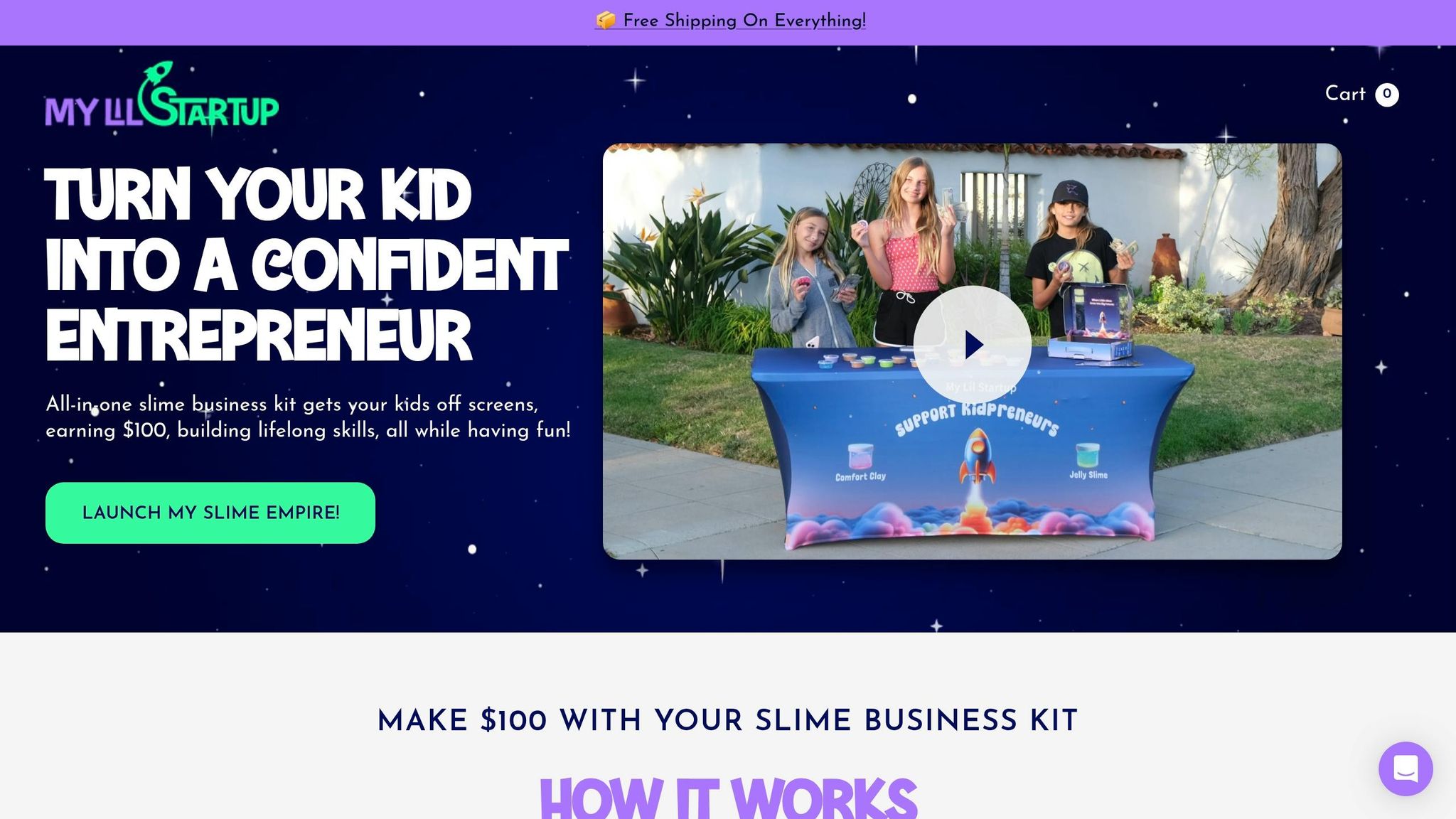
By applying mobile design best practices, entrepreneurship features can transform how kids interact with technology. A great example is My Lil Startup, a platform that inspires young entrepreneurs with hands-on learning opportunities. One standout offering is their Slime Business Kits, aimed at kids aged 6–12. These kits include 20 pre-made slimes, decorations, marketing materials, and a sales tracker, with prices ranging from $39.95 for the Starter Kit to $99.95 for the Mogul Bundle. The platform itself is the brainchild of Jon and his 11-year-old daughter Chloe, who turned her first slime sale into a $100 profit in just an hour.
When showcasing tools like this on mobile platforms, it’s crucial to tailor the design to the target age group. For younger kids (ages 6–8), use bright visuals and simple language to keep things engaging. Older kids (ages 9–12) will appreciate features that mimic real-world business operations, like financial tracking tools. Place key calls-to-action, such as "Start My Business", in easy-to-reach areas like the thumb zone for one-handed navigation. Sticky CTAs that stay visible while scrolling can also boost usability.
To keep kids motivated, incorporate features like progress tracking and small, achievable goals. Gamification elements - missions, badges, and revenue progress bars - can help build persistence. However, the focus should lean toward intrinsic rewards, emphasizing the real-world results of their efforts, like what they can create, sell, or share, rather than relying solely on external rewards.
For parents, who often make the purchasing decisions, include sections that highlight safety features, certifications, and parental controls to build trust.
Finally, streamline forms and sign-ups with mobile-friendly HTML tags like type="email" or type="tel" to trigger the right keyboard and reduce friction during registration. Every key action, whether it’s ordering a kit or browsing product details, should be designed for quick, one-handed completion - ideally under 30 seconds. These thoughtful design strategies not only simplify the user experience but also empower kids to take their first steps as entrepreneurs.
Conclusion: Building Mobile Websites Kids and Parents Love
Creating mobile websites that appeal to both kids and parents is all about balance. Kids are drawn to bright colors, engaging interactions, and instant visual or auditory feedback. Meanwhile, parents prioritize safety, transparency, and a clutter-free design without intrusive ads. As Vitaly Friedman aptly notes:
"Whenever you are designing for children, you always design for parents as well. In fact, parents are the most demanding users you can find."
To keep users engaged, prioritize usability. Place essential actions within the thumb zone and ensure pages load in under 3 seconds - any delay risks losing users. Adjust tap target sizes to suit different age groups, making navigation easy for small hands while maintaining trust with parents.
Performance is another key factor. With 72% of global web traffic coming from mobile devices, even a one-second delay can cut conversions by 7%. Optimized images, intuitive navigation, and a mobile-first design are essential to keeping users happy and engaged.
Tailor your design to specific age groups, considering differences in cognitive and motor skills. Use large, simple fonts (18–19 pixels) and replace complex ideas with straightforward icons and visuals. Parental controls are a must - tools that let parents set time limits and permissions help build trust and confidence.
Lastly, consider features that inspire creativity and learning. For example, tools like My Lil Startup's Slime Business Kit combine fun with skill-building, offering kids a chance to explore entrepreneurship while enjoying a seamless, engaging mobile experience.
FAQs
How do I choose the right button size for each age group?
When designing for children aged 3–12, it's important to consider their motor skills. Larger buttons, roughly 50 px or 10×10 mm, make it easier for younger kids to tap accurately. To avoid accidental taps, leave 12–48 px of spacing between buttons.
For accessibility, make sure buttons are at least 42 px (or 9×9 mm) - this ensures usability even for those with less precise coordination. As kids grow and their motor skills improve, you can fine-tune button sizes to match their developing abilities.
What safety features do parents expect on a kids’ mobile website?
Parents want kids' mobile websites to offer content filtering to keep out inappropriate material, monitoring tools to track activity, and screen time controls to manage usage. They also look for secure login systems, strong privacy protections, and clear policies on data collection. These features help create a safer, more transparent online space tailored for children.
What’s the fastest way to get a kids’ site loading under 3 seconds?
If you want a kids' website to load quickly - ideally under 3 seconds - there are a few important steps to focus on:
- Use a responsive design: Make sure the site adapts seamlessly to mobile devices, as many kids use tablets or phones to browse.
- Optimize images: Compress images without losing quality to reduce load times.
- Streamline code: Cut down on heavy scripts and unnecessary code to keep things running smoothly.
- Enable caching: Store assets like images and scripts locally so the site doesn’t have to reload everything from scratch.
Make it a habit to test your site’s performance regularly. This way, you can catch and fix any speed issues, ensuring a fun and frustration-free experience for young users.